We design libre / open source fonts. Learn more and contribute to the adventure of Velvetyne by reading our “about” page.
About ASCII art and Jgs font
Introduction
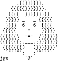
I am Adel Faure, ASCII artist operating within the Mistigris and Textmode Friends collectives. I’ve been generously invited by Velvetyne to publish Jgs Font on their foundry. Jgs Font is a typeface that I’ve created as a tribute to artist Joan G. Stark and that I use to make ASCII art (see specimen).
In this article I contextualize what ASCII art is, who Joan G. Stark is, what could be seen as a “history of text mode arts”, what does ASCII Art means today, and what are the characteristics of the Jgs font.
I’d like to sincerely thank Heikki Lotvonen for sharing two iconographic references with me (The Printer’s Grammar, John Smith, 1755 and Improvisation, late 18th century) as well as for his text ASCII art : From a Commodity Into an Obscurity, that helped me greatly.
I’d also like to thank Raphaël Bastide, Ève Gauthier and Vincent Maillard for helping me review and finish this text.
Last but not least, many thanks to Ariel Martín Pérez for his proofreading and and for the English translation of this text.
Good read!
What is ASCII Art?
It isn’t that simple to explain what ASCII Art means. More than defining a well established practice, ASCII Art blurs the habitual distinction between image and text, in the art world, and between “graphic interface” and “text mode,” in the informatics domain.
Strictly speaking, the expression designates pictures composed by using the 128 characters contained in the American Standard Code for Information Interchange (shortened as ASCII). Even if the terms “Text Art” or “Textmode Art” are also used, “ASCII Art” or just “ASCII” has become a way of naming all pictures produced with the help of typographic elements. In 1999, in The History of ASCII (text) Art, Joan G. Stark describes ASCII in the following way:
They are “non-graphical graphics”. Its palette is limited to the symbols and characters that you have available to you on your computer keyboard. [1]
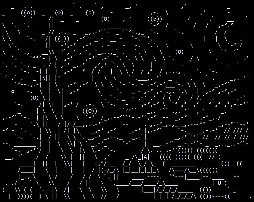
Joan G. Stark, A.K.A. jgs or Spunk, is probably the most popular and prolific ASCII artist of the 1990s and the ’00s, who left a strong imprint on online amateur practices and aesthetics. Stark started making ASCII art in 1995 as part of the <alt.ascii-art> newsgroup on USENET. Being passionate about folklore and popular art, she devoted herself to represent in a “line style” way (that could be seen as close to the “ligne claire” style in comics) countless mythological creatures, animals, landscape elements, objects and scenes of everyday life. She published the totality of her drawings as well as texts about ASCII, its practice and its history, on her website www.ascii-art.com. Even if the website is no longer online, it can be accessed through many links like this one..
Her definition of ASCII as “non-graphical graphics” plays with the ambiguity of the English word “graphic”, which either means a figurative object or an element of a graphic interface. At the time of Stark’s phrase, the first digital social networks (Usenet, BBS, Minitel, Ceefax, etc.), still very popular back then, worked in “text mode”. They present user interfaces where the screen is divided in a grid in which each case can display a single glyph. As these interfaces disappeared in favor of graphic interfaces, Stark underlines with irony the ambiguous status of ASCII art: the presence of graphic elements in text environments becomes this oddity that is ASCII.
Even as she embraces its complexity, Stark summarizes the practice of ASCII to something very simple: it’s a way of drawing with what a computer keyboard provides. “Its palette is limited to the symbols and characters that you have available to you on your computer keyboard.” Based on this statement, one can only imagine that each system associated with a keyboard would produce a different ASCII. That’s the reason we can find terms like PETSCII associated with the Commodore PET/CBM, ANSI with the BBS (Bulletin Board Systems), ATASCII with Atari, Shift-JIS with the Katakana mode of Japanese keyboards, Teletext with Videotext (Prestel, Minitel). In this galaxy, the expression “ASCII” refers more specifically to the Amiga styles (oldschool and newschool), or the Usenet styles (line-style and solid-style). Each one of these ASCII have their own scene, with their groups, their artists and sometimes even their own publishing platform.
- www.asciiarena.se - Amiga ASCII
- www.16colo.rs - ANSI
- www.csdb.dk - PETSCII
- www.teletextart.co.uk - Teletext
Some examples
In the same way that each system can have their own specific ASCII art, each style has their own origin, practice and history.
The PETSCII character set, designed mainly by Chuck Peddle, the designer of the Commodore PET, and by Leonard Tramiel, son of the Commodore founder, includes patterns and geometrical shapes, which facilitates the creation of games on a text mode-only system.
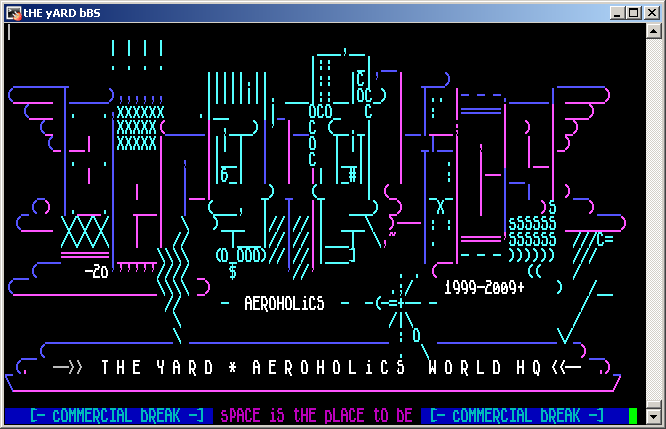
In ASCII art : From a Commodity Into an Obscurity, Heikki Lotvonen recalls the social role of ASCII art in the emerging ANSI scene. Users who were not hackers but who were skilled in ASCII art could obtain access to the contents of pirate BBS in exchange for their illustrations.[^2]
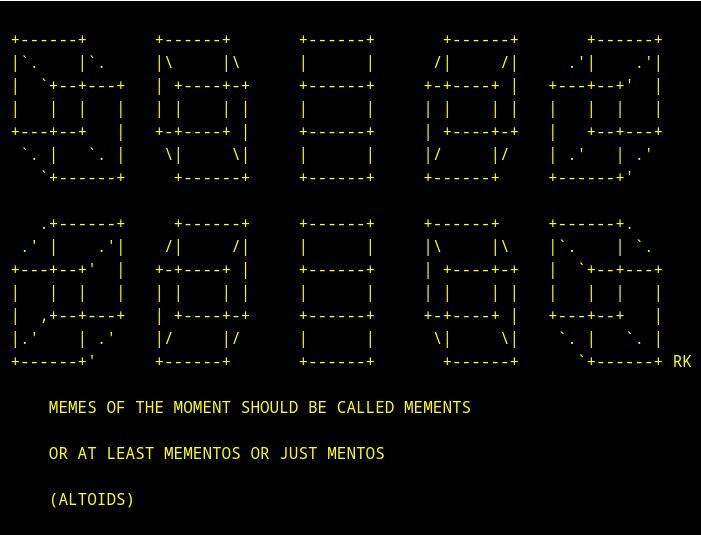
As it’s very simple to reproduce and to modify it (by copy and paste), ASCII was the preferred way to display memes on the first forum networks, notably visible in the immense archive of www.asciiartfarts.com (archived) (which unfortunately contains numerous examples of homophobic, misogynistic and/or racist content).
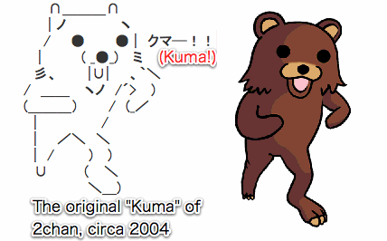
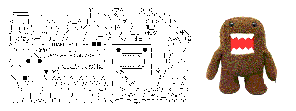
Certain popular internet characters come specifically from ASCII art. That’s the case, for instance, of “Kuma” (later known as Pedobear) and of “Domo”, of which the particular shape and positions have their origin on SHIFT-JIS shared on 2chan.
A history of text-mode arts
In the late ’00s, Unicode became the international standard for the digital encoding of characters. As its name suggests, Unicode has the objective of comprising the totality of character encoding modes, therefore rendering obsolete the technical particularities of former techniques associated with ASCII, ANSI, ATASCII, PETSCII, SHIFT-JIS, etc. Even if the emulation of older OS and the strict application of their standards constitutes a significant part of the practices within the contemporary ASCII scenes, it is clear for many artists that ASCII art is a notion that needs to be extended beyond the technical specificities of particular machines. Some of them prefer to use the notion of “Textmode art”, as the name of the group “Texmode Friends” suggests.
This attitude reinforces once again Stark’s approach to ASCII art as a practice that isn’t solely based on the use of a particular encoding system but rather on the possibility to create art with shapes that stem from the mechanization of text.
This way, beyond the digital realm, everywhere and each time mechanized text provides constraints, we can find a specific form of art in the shape of text mode, ASCII art.
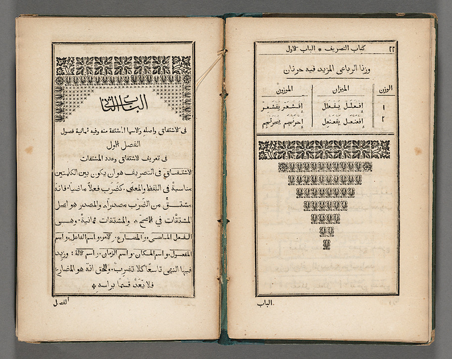
In Neither Good, Neither Good, Fast, Nor Cheap: Challenges of Early Arabic Letterpress Printing, Hala Auji describes how printers of the first printing presses of the Middle East bypassed the limits of lead composition in order to produce ornaments.
Les manuscrits, par exemple, comportaient des enluminures, à la manière de frontispices, appelés sarlawh ou ’unwan. Ces derniers, souvent très élaborés, étaient colorés et dorés à la main, afin d’indiquer le début de chaque livre et des chapitres suivants […]. Pour rappeler ces motifs dans leurs livres imprimés, les employés de cette presse ont utilisé divers types d’ornements, ainsi que des signes de ponctuation, reproduisant de manière créative des compositions similaires.
Manuscripts, for example, used illumination devices, akin to frontispieces and headpieces, called a sarlawh or ’unwan. These were often elaborately hand-colored and gilded, to indicate the start of each book and its subsequent chapters […]. To recall these elaborate designs in their printed books, employees at this press creatively employed varied ornamental sorts, as well as punctuation marks, to create similar compositions.[3]
This way of subverting the art of typographic composition in order to produce images isn’t rare in the field of printing with movable lead type, which became a necessity when there were missing pieces and turned into a hobby for passionate employees.
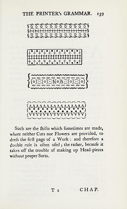
Such are the shifts which sometimes are made, where neither Cuts nor Flowers are provided, to dress the first page of a Work : and therefore a double rule is often used ; the rather, because it takes off the trouble of making up Head-pieces without proper Sorts.
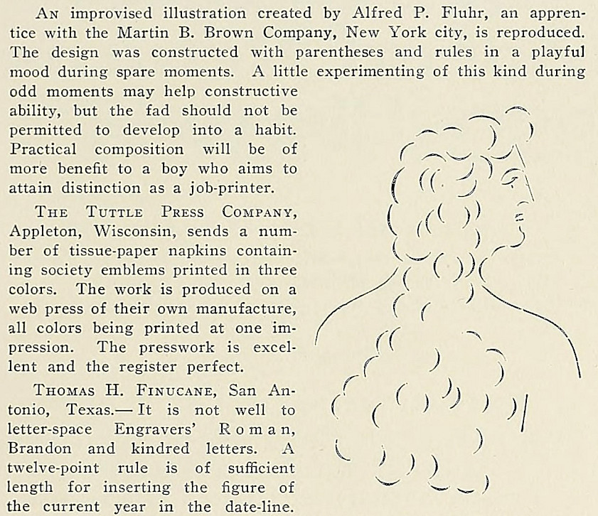
An improvised illustration created by Alfred P. Fluhr, an apprentice with the Martin B. Brown Company, New York city, is reproduced. The design was constructed with parenthesis and rules in a playful mood during spare moments. A little experimenting of this kind during odd moments may help constructive ability, but the fad should not be permitted to develop into a habit. Practical composition will be of more benefit to a boy who aims to attain distinction as a job-printer.
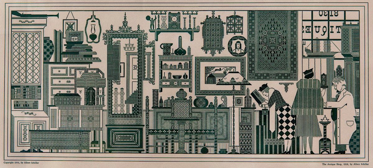
Certain printers, such as Albert Schiller, who chose to specifically exploit these kinds of methods to produce art works, were in some way the ASCII artists of their time.
Is ASCII art a relic from the past?
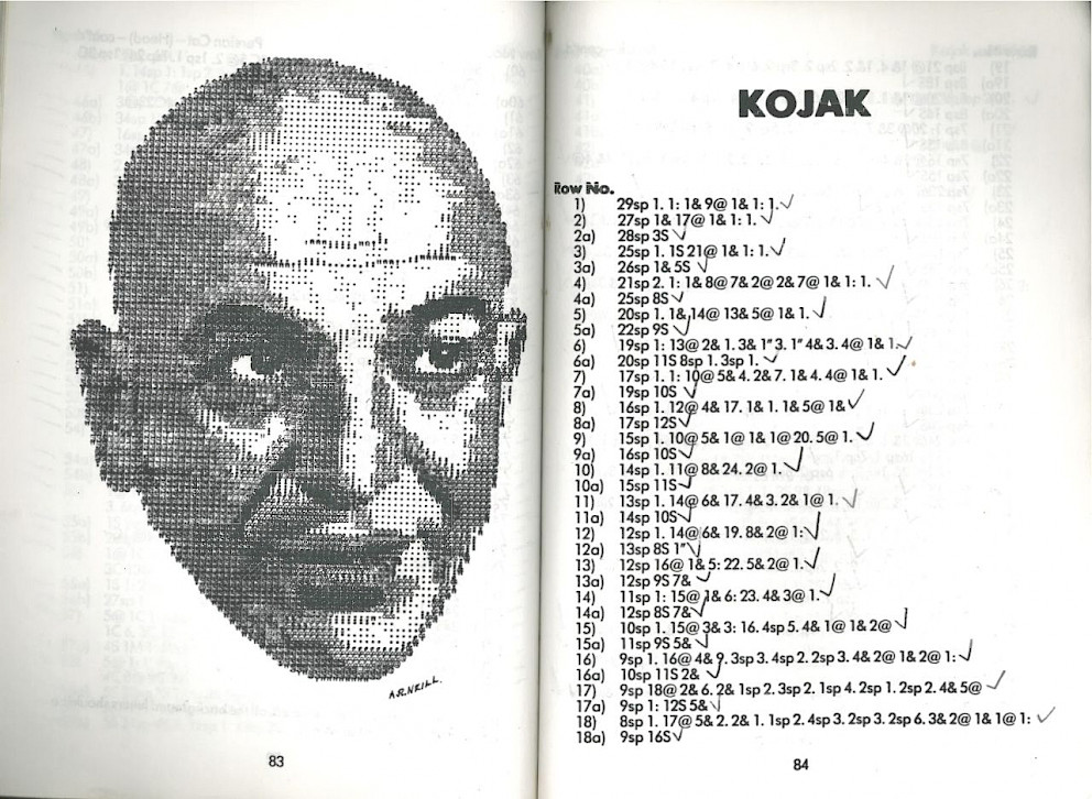
In the same way that the popularization of graphic interfaces and the arrival of Unicode could have sent ASCII art to oblivion, the personal computer could have made typewriter drawing disappear. Yet the practice of the latter continues to be revisited. Below this paragraph there’s an extract from «Bob Neill’s book of typewriter» where images composed with a typewriter are accompanied with the protocol that would allow reproducing them, either by hand or by using a typewriter. This book, published some mere years before the rapid decline and the almost-complete disappearance of typewriter use, replaced by computer keyboards and by text treatment programs, confirms in a way the survival of the typewriter medium before it was actually rendered obsolete.
The popularity of the artist James Cook is a good contemporary example of this survival. Cook, however far from the digital practice, proposes to us typewriter artworks made “en plein air”, directly done in front of the model, even outdoors, in the manner of a traditional painter.
Through the long history of the mechanization of text, despite the sense of obsolescence that stems from innovation processes, ASCII arts have allowed numerous forgotten machines, deemed as useless, to reemerge. They have revealed formal and cultural particularities that are impossible to replace. A manner, in some way to prove that a technical mean can never be truly reduced to impertinence or nostalgia.
The lure of ASCII art might not be in the nostalgia of how it looks, but what it represents: the ideals of «cyberspace». It stands for a wistful longing for those pre-internet days when corporations hadn’t yet taken control of our digital day-to-day and the community was still in control of organising itself.[4]
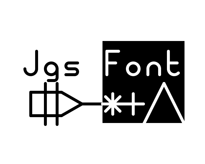
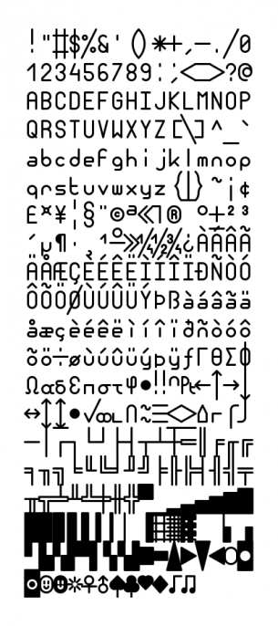
Jgs Font : a free monospaced font designed for ASCII art. A tribute to Joan G. Stark, ASCII art pioneer
The visual aspect of text-based artworks is highly dependent on the font used. That’s why ASCII art is a highly typographic matter.
The most popular fonts used by ASCII artists are mainly those that come by default with legacy systems.
This is the case of Monaco and Menlo, which have long been the default monospaced fonts integrated into macOS, associated with ASCII line-style. An emblematic example is MS PGothic, the eternal font of SHIFT-JIS practices, the first Microsoft font to include “CJK characters”, i.e. the inclusion of encoding tables for the Chinese, Japanese and Korean languages.
While being very inspired by Stark’s work, which draws in ASCII using Microsoft fonts such as Courirer from FixedSys, I started ASCII art using a Truetype adaptation of TopazPlus, a Commodore 64 font. This adaptation is part of the Multi Platform Fonts In Amiga Aspect project by the TrueSchool ascii group published in 2009. It contains vector versions of the most popular fonts used in the Amiga scene. Most of these fonts are themselves created by artists from the Amiga scene, such as P0T-NOoDLE by Leo “Nudel” Davidson or MicroKnight, whose author is unknown
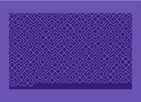
TopazPlus, like most Amiga fonts, has slash and anti-slash glyphs that join character to character and line to line. This feature is at the heart of the famous BASIC command “10 PRINT CHR$(205.5+RND(1)); : GOTO 10”, producing an infinite labyrinth.
I was very impressed by this feature, finding in it the resolution of the continuity effect I was looking for as an ASCII artist. So I started working on a font in which all the glyphs would be as close as possible to this effect.
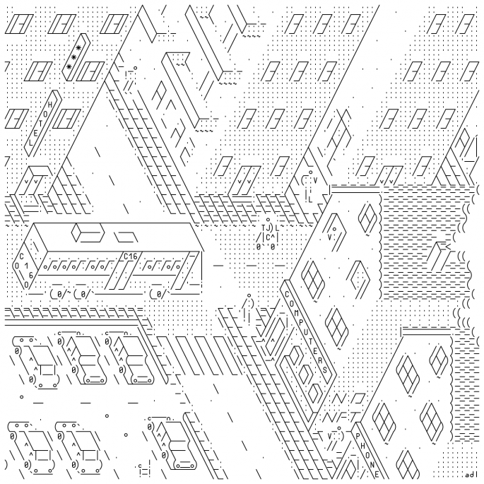
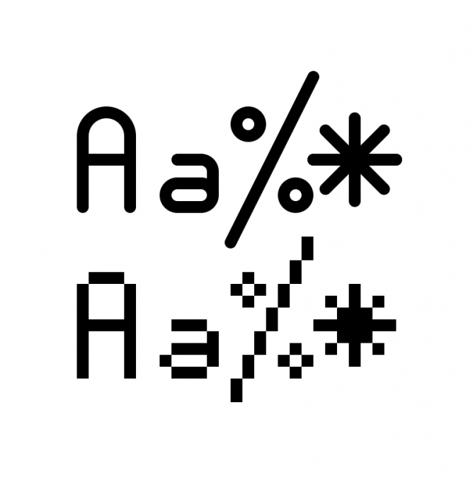
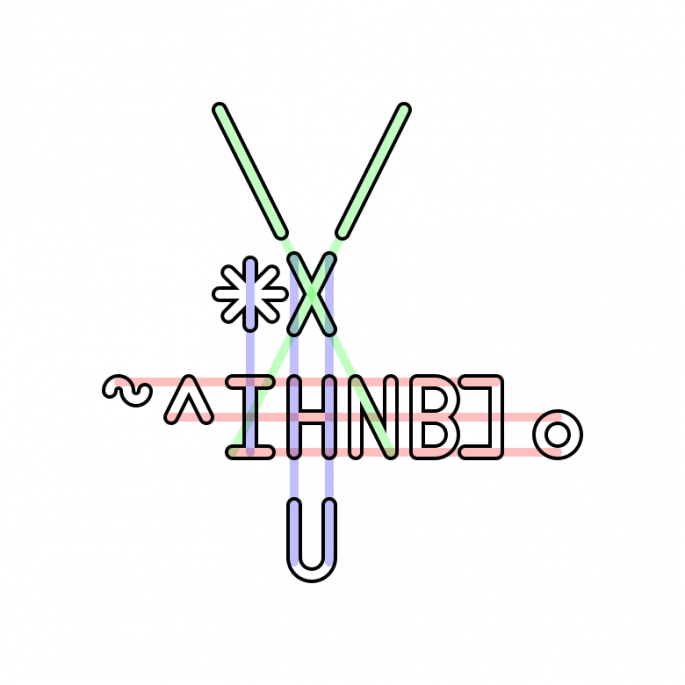
This is the principle behind the Jgs font. Its bitmap appearance and shapes accentuate the ambiguity between text and drawing. The graphic properties of the characters have been exaggerated according to the way ASCII artists use them.
The glyphs that make up Jgs Font can be combined, sometimes in every direction. It allows, by association of characters, to produce continuous lines, curves, frames, patterns, levels of gray.
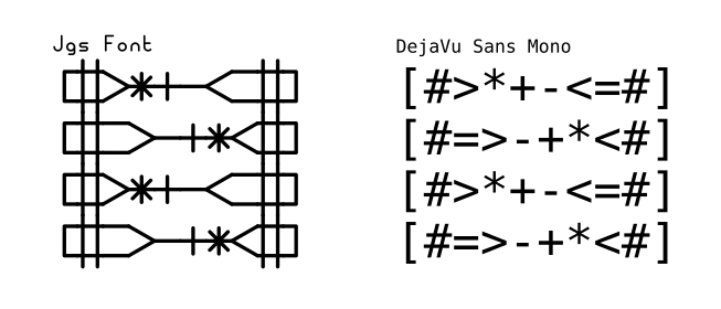
When glyphs don’t combine directly, their shape is designed so that they can match from afar.
The Jgs font comes with the ASCII and Latin-1 Supplement encoding tables, as well as the glyphs found in code page 437, used for ANSI art.
To conclude, you should know that this font is under free license. You are therefore authorized to download it, share it and even modify it, as long as you credit its origin. I hope you’ll draw lots of cool things!
-
What is ASCII art ?, Joan G. Stark, 1998
-
ASCII art: From a Commodity Into an Obscurity, Heikki Lotvonen, 2022
-
Neither Good, Fast, Nor Cheap: Challenges of Early Arabic Letterpress Printing, Hala Auji, 2017
-
ASCII art: From a Commodity Into an Obscurity, Heikki Lotvonen, 2022