We just released Ouvrières by Laure Azizi!

We design libre / open source fonts. Learn more and contribute to the adventure of Velvetyne by reading our “about” page.

Grotesk

ⵙⴻⵅⵙⵉ ⵜⵉⵎⴻⵙ ⵜⵓⵔⴰ

grotesk 01extrafin

ⵙⴻⵅⵙⵉ ⵜⵉⵎⴻⵙ ⵜⵓⵔⴰ

grotesk 02mince

ⵙⴻⵅⵙⵉ ⵜⵉⵎⴻⵙ ⵜⵓⵔⴰ

grotesk 03regular

ⵙⴻⵅⵙⵉ ⵜⵉⵎⴻⵙ ⵜⵓⵔⴰ

grotesk 04gras

Designed by

Frank Adebiaye, with the contribution of Ariel Martín Pérez

Styles

  • grotesk 01extrafin
  • grotesk 02mince
  • grotesk 03regular
  • grotesk 04gras

Date

Initialy published on May 12, 2010 and updated on January 13, 2023

Get the PDF specimen
Ce contenu existe en Français

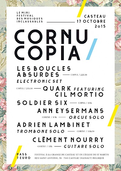
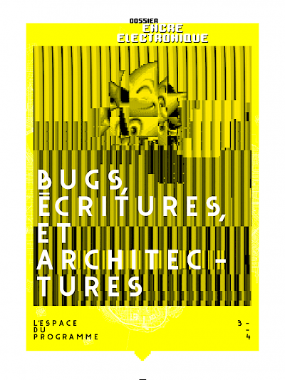
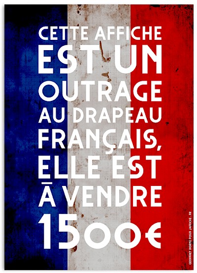
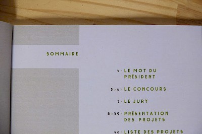
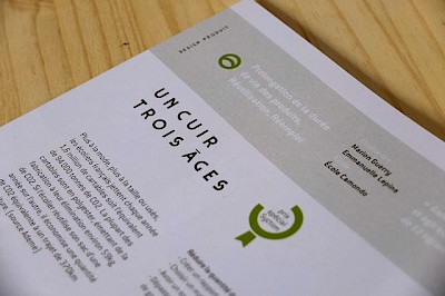
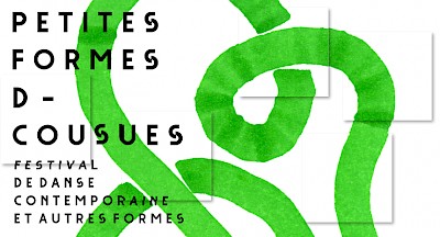
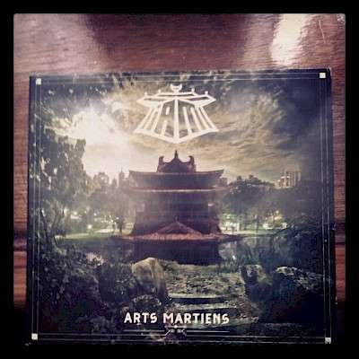
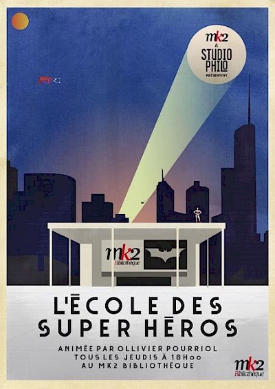
Grotesk is one of Velvetyne's first published typefaces. Designed by Frank Adebiaye in 2010 and released on Velvetyne in 2012, Grotesk is a heavily geometric sans serif typeface with an unusually large spacing. The original version of Grotesk is known because it was used on the official website of the city of Paris for many years. Even if the city's visual identity has changed since then, the broken "S" of Grotesk can still be seen in some of the technical vehicles of the city.

In 2023, a new version of Grotesk developed by Ariel Martín Pérez was released. This new version introduces new weights that are multiplexed, which means that you can change the weight of the font without changing the width of the paragraphs. This new version also presents some subtle optical corrections. Last but not least, it considerably expands the glyphset of the font with a brand new lowercase set as well as language support for Russian, Ukrainian, Tifinagh and many Latin-based languages.

You can use Grotesk to give a relaxed and elegant touch to your texts, its subtle art-déco flavour will enlighten any composition.
Related Articles

Grotesk for Paris.fr
Grotesk
WATER DRAGON HABITAT
TOUJOURS S’AIDER JAMAIS CÉDER
A B C D E F G H I J K L M N O P Q R S T U V W X Y Z
You spotted snakes with double tongue, Thorny hedgehogs, be not seen; Newts and blind-worms, do no wrong, Come not near our fairy queen.
A
A
A
A
Ох, тяжко, важко!
Here I pause for one moment, to exhort the reader never to pay any attention to his understanding when it stands in opposition to any other faculty of his mind. The mere understanding, however useful and indispensable, is the meanest faculty in the human mind, and the most to be distrusted; and yet the great majority of people trust to nothing else,—which may do for ordinary life, but not for philosophical purposes. Of this out of ten thousand instances that I might produce, I will cite one. Ask of any person whatsoever, who is not previously prepared for the demand by a knowledge of perspective, to draw in the rudest way the commonest appearance which depends upon the laws of that science; as for instance, to represent the effect of two walls standing at right angles to each other, or the appearance of the houses on each side of a street, as seen by a person looking down the street from one extremity. Now in all cases, unless the person has happened to observe in pictures how it is that artists produce these effects, he will be utterly unable to make the smallest approximation to it. Yet why? For he has actually seen the effect every day of his life. The reason is—that he allows his understanding to overrule his eyes. His understanding, which includes no intuitive knowledge of the laws of vision, can furnish him with no reason why a line which is known and can be proved to be a horizontal line, should not appear a horizontal line; a line that made any angle with the perpendicular less than a right angle, would seem to him to indicate that his houses were all tumbling down together. Accordingly he makes the line of his houses a horizontal line, and fails of course to produce the effect demanded.
Download Grotesk