We design libre / open source fonts. Learn more and contribute to the adventure of Velvetyne by reading our “about” page.
The Origins of Ouroboros
At the end of 2016, I was really inspired by Elmer Stefan’s project of reviving Victorian typefaces under the guise of The Pyte Foundry. I wanted to create a typeface that was intentionally expressive and ornamental, with a kind of flair that I felt was missing from the open-source type scene.
Based on this premises, my initial concept was to draw letter shapes with a very large serif area, as large as possible, which then I could “carve” in order to create a myriad of decorative effects.
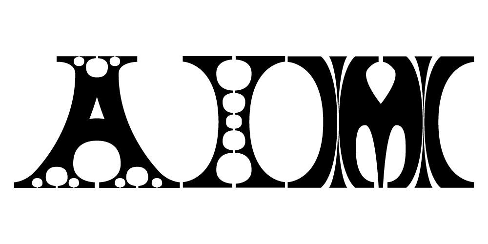
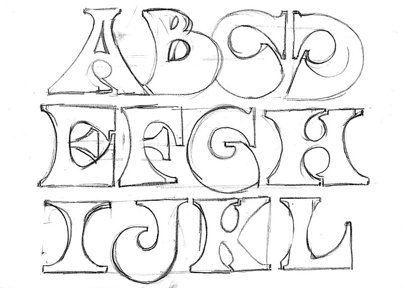
With this idea in mind, I started doing some pencil sketches of these kind of letters. Their serifs were so large, that they created concave counter-forms between the letters that were oval-shaped, or egg-shaped sometimes. The openings on the letters would be very narrow (as for the letter E) and, sometimes, they would overlap themselves in a weird way (this idea was later abandoned). This produced a visual aspect for the capitals not unlike bubbles in dark ink spreading through the page, or at least that’s how I saw it.
Look at those bell-bottoms!
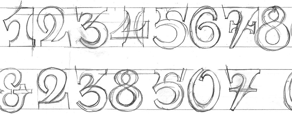
Based on these sketches, I started to trace some letters on the computer. When I had a doubt about how a particular letter would be constructed, I would use Benguiat as a reference, so Ouroboros is relatively influenced by it.
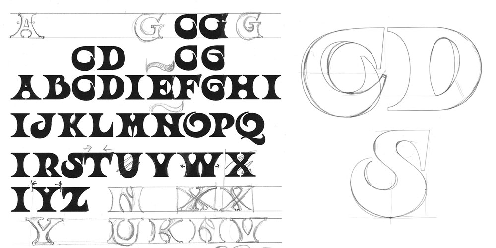
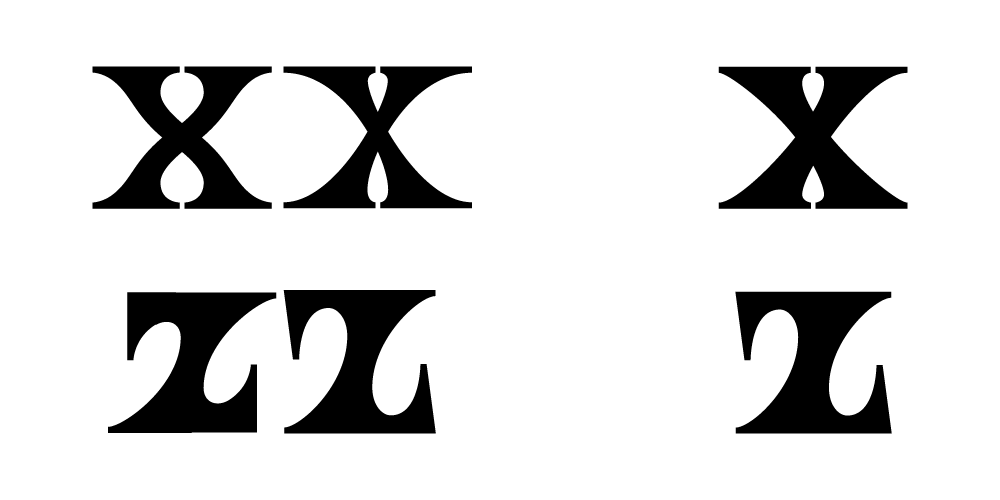
Because I based my design solely on vertical and horizontal anchors, drawing some of the letters, like the Z and the X, proved to be quite a challenge. It was necessary to strike a delicate balance to keep the strokes consistent with those of the other letters, and at the same time keeping the impression of a diagonal stroke.
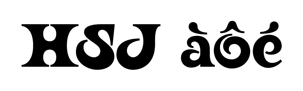
In addition to letters like the H (which were rather square, with a strong vertical axis), there were some others like the S and the J which were quite asymmetrical and curved in a sensuous way. The spline of the S is quite narrow compared to the rest of the strokes, and its shape mimics the gesture of someone pressing a paint brush on a support while applying a circular motion. This is a deliberate reference to art nouveau letters, which were often produced with brushes, rather than with pens. Some other details, like some of the accents, also recall brush strokes.
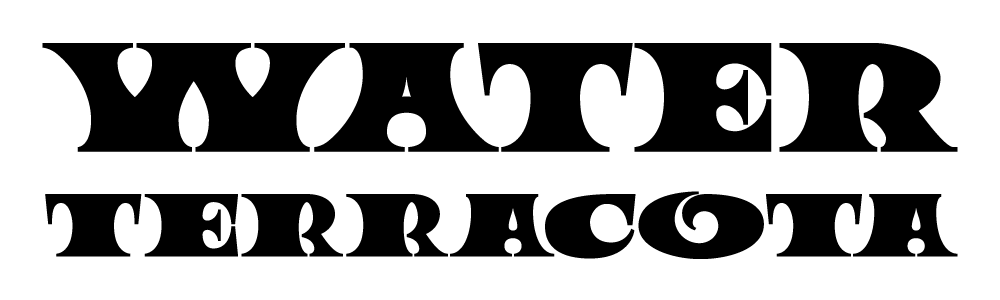
By that time of the design, the name I had in mind was “Circus Maximus” (I saw it as a tongue-in-cheek nod to Momus’ debut album rather than to classic Rome). My initial intentions were to create an extended style of the typeface so it could be used to compose circus posters, with letters of different widths. But with some letter shapes, like the O, this approach didn’t work so well.
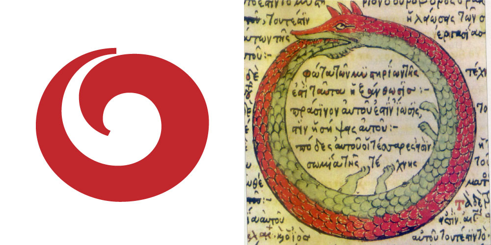
The problem was that 1) the name “Circus Maximus” was already taken by an existing font and specially 2) the typeface didn’t feel so circus-like after all. But one day, I came upon the name “Ouroboros” and all the pieces of the puzzle fell in place. The name wasn’t taken by any existing font, it conveyed the magic and fantasy feeling that I wanted to express, and most important of all, the O shape that I had drawn looked like an actual Ouroboros! So, it was perfect for this project.
During online conversations with Sébastian Hayez, who was an early fan of the typeface, the will of creating lowercase characters slowly started to take shape.
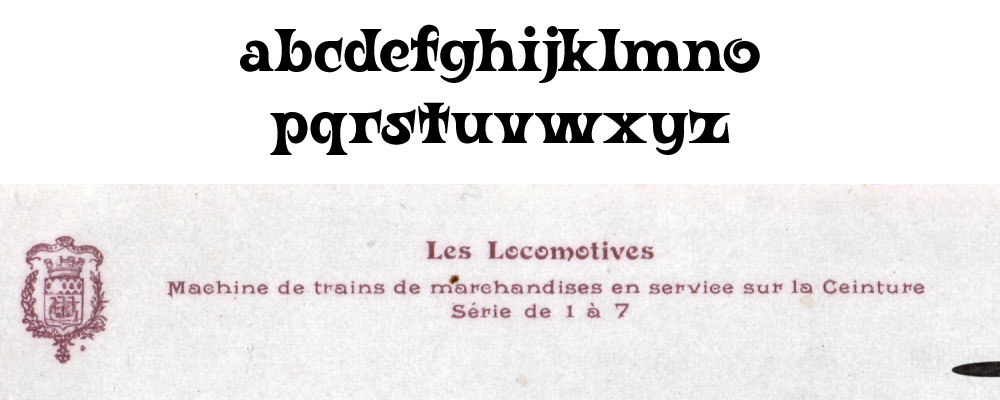
Ouroboros’ lowercase letters take some cues from ornamental typefaces such as Deberny & Peignot Les Modernes [here seen on the “Les Locomotives” title] [later released as DeVinne Ornamental by Stephenson Blake around 1900, today owned by Linotype], which can be commonly found on antique French postcards.
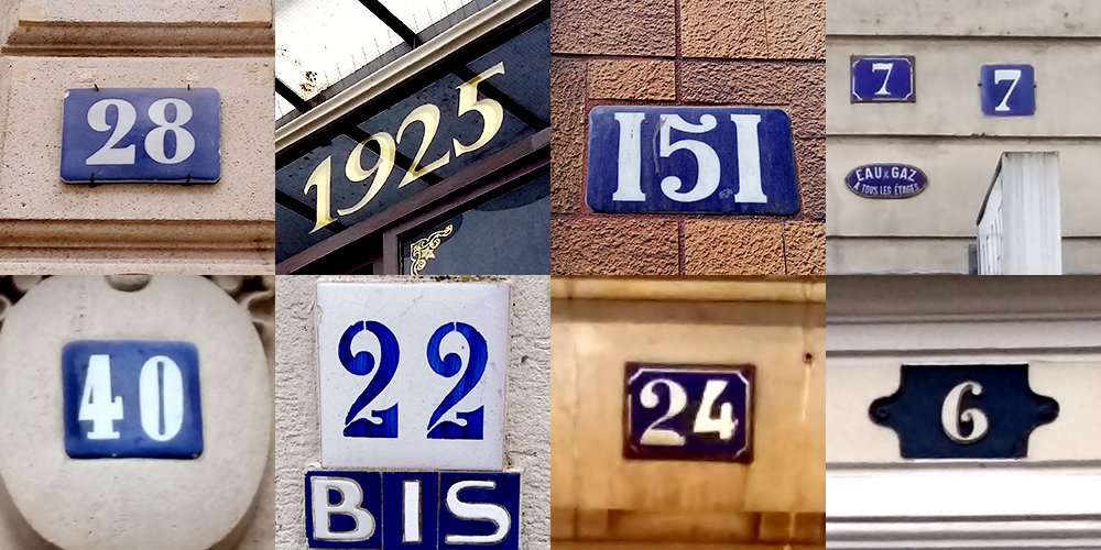
As for the numerals, my main inspiration [and a massive, ongoing obsession during the last months] were vintage number signs found all around Paris.
The relationship between Art Nouveau letter shapes and magical themes was a strong one [Check out Manuel Orazi’s Calendrier Magique over at Gallica.fr if you have the time], and the Ouroboros is also an important symbol for alchemy, so the next logical step was the development of magical and alchemical symbols. The challenge here was keeping the same calligraphic feel and mood of the letters on symbols that 1) were radically different at times and specially 2) were so complex that the same stroke width [present on the rest of the letters] could not be maintained.
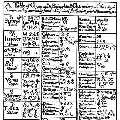
“A Table of Mediaeval Alchemical Symbols” from Basil Valentine’s The Last Will and Testament [c.1670] [detail]. Alchemical symbols were originally drawn on manuscripts [even if metal-cast versions of some symbols exist] and their representation varied wildly between authors. Contrary to the letters of the latin alphabet, there’s no general guide about how to draw them [and specially where their baselines should be placed exactly!], so the ones you see in Ouroboros are my personal interpretation.
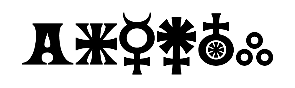
Some of Ouroboros symbols compared to a capital A. As alchemical symbols come from very varied sources and authors, it was difficult to keep a homogeneous look. For the smallest circle shapes of the symbols, the contrast of the stroke disappears, as it happens when one tries to draw a very small circle with ink, instead of a large one.
After a preliminary online publication of the font on October 10th 2018 up at Font Library, the people over at Velvetyne told me that they were really interested in releasing it (we know each other for some years now actually). The date of the 31st October was proposed (just in time for Halloween). Between these two dates, I went a little bit crazy improving the kerning, fine-tuning the design of some characters and adding new symbols, accents and stylistic sets. 130 ligatures were implemented, as well as positional variants, which allowed the text to become a bit more compact, specially for texts set in all-caps. As for the resulting font, you can check it yourself by downloading it.
See you later, alligators!