We design libre / open source fonts. Learn more and contribute to the adventure of Velvetyne by reading our “about” page.
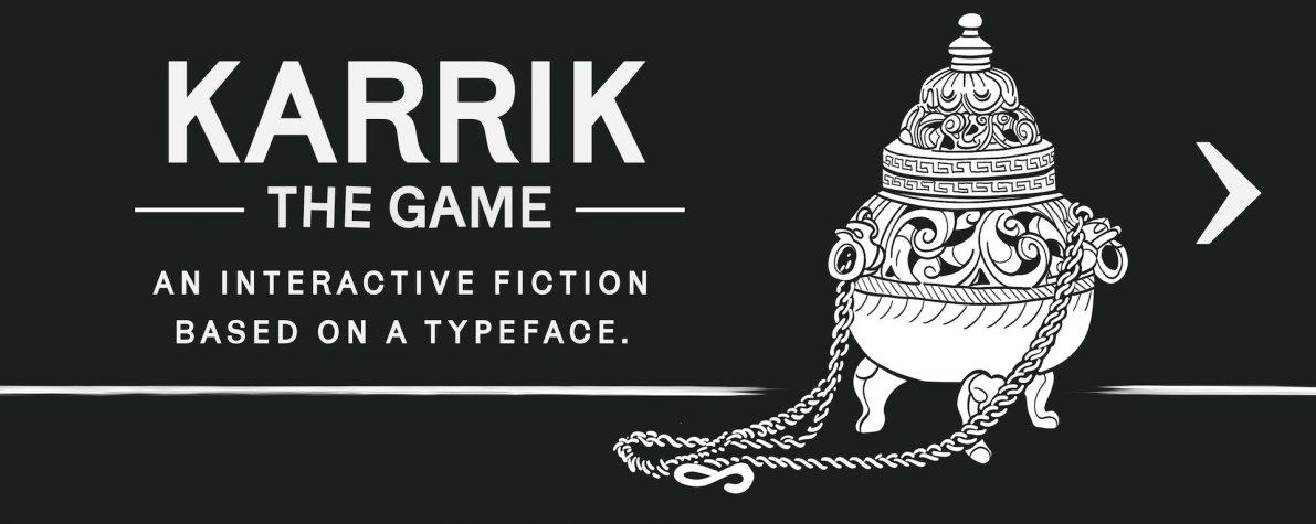
KARRIK—THE GAME
Early access
When we released Karrik, we also published quite confidentially a little interractive fiction to go with it. I was thinking about to write one for a long time, because it seemed a fun way to show what a font can do in small size and what is its real texture while you read. And Karrik—because of its background (a custom font made for the issue of Cercle magazine dedicated to the topic of Ghosts)— was a good candidate. This family was intended to look as an old-fashioned sans-serif, bringing the clumsyness from both vernacular typography and obscure early 20th c. foundries. Karrik comes from the “bad” typography of ghost towns and half erased road signs, and I thought it would do a good job setting the mood of a murder story in a countryside village with some supernatural twists. In the end we didn’t communicate a lot about it because it was only one small piece of the promotion materials, but we all felt this game had some potential of its own. So when I posted it on reddit to have some feedback from the community and Gibbo contacted me to offer to edit and proofread it—we thought it was about time to level up and make a nice upgrade.
Patch
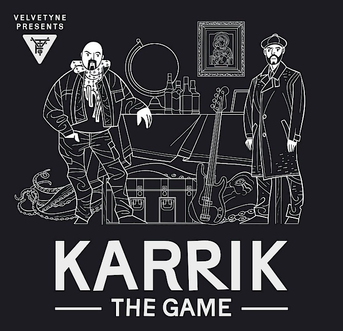
We hired Gibbo to edit and proofread the text. He made a very good job, correcting grammar and spelling mistakes, but also making the story more smooth. He suggested a tons of micro-improvements that, just like in type design, can seems very small one by one but make the whole a lot better in the end. With such a good text in our pocket, we felt we needed to enhance it again. So came the idea of illustrating it. One big beautiful image to have a kind of cover, like an actual book.
DLC
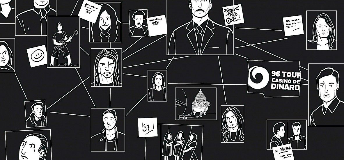
One of our very dear team member (Julien Imbert) suggested to contact John Grümph, a table top rpg writer and a skilled illustrator, to make this image. But after a few exchanges it appeared that Le Grümph had the time (and the motivation) to make more than one image. Like many. He played the game, choose key moments, and delivered nice clean black and white drawings that match perfectly the mood of the story. I can’t show them all, because you need to discover them in-game, but geez, look at this.