We design libre / open source fonts. Learn more and contribute to the adventure of Velvetyne by reading our “about” page.
The making of Cantique
Disclaimer:
As of our update of November 2023, Cantique has been retired from Velvetyne. You can still download it here. To know more about the reasons behing this retirement and the list of the other retired fonts, please read the dedicated article we wrote on the topic.
Well, that post was supposed to be a review of the history of my latest type design called Cantique. But to be honest, even if i’m satisfied with the global mood, the few originalities, i’m not a type designer and will never pretend to be one: my eyes are always judging what is right or wrong and my final point of view is changing every time i’m looking closer at a curve.
So I will give you few elements about how I came with this type design, but that’s not the most important step in understanding why this creation is important to me. In order to understand, I also have to deal with details about my personal life at those moments.
Cantique was a sans
Cantique was started 2014 when I was approached by a libanon-french fashion stylist who was working on a book project gathering photographs, illustrations & paintings on the global topic of shamanism. Before designing some pages, I’ve proposed to set the global identity on a custom typeface.
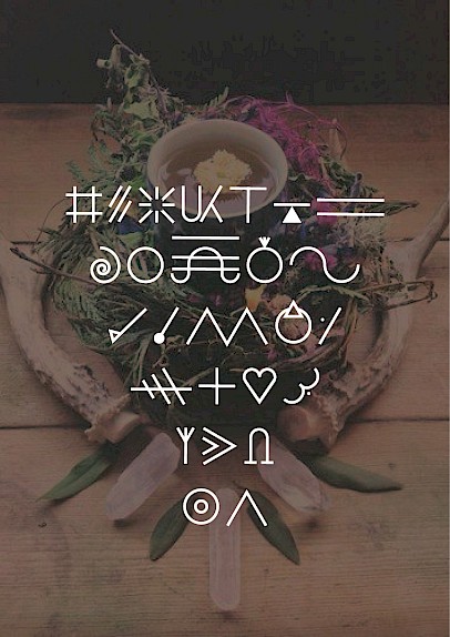
Shamanism is a cultural phenomenon shared all around the globe, probably set in the spirit of humans since prehistoric ages. Mongolia could have been a starting place but it’s probably because the practice is very deep and still active today. Shamanism is not linked into any writing system, as many esoteric practices, the knowledge is linked with orality as a close human way of transmission. So I prefered to work with basic geometric shapes, as it’s a pure vocabulary that don’t express any typical culture or religion, and to be honest, it was easier and totally trendy at this time.
At this time, I was still interested in old lettering from bookplates of the end of the XIXth century and the beginning of the XXth century. I’ve found an interesting sample of beautiful lettering (now lost, sorry). The particularity was that the letters were designed in two levels: somes were at a classical x height when some others were on 2 x height depending of the geometry of each letters. This also shares the same structural construction than some contemporary typefaces designed by french graphic designer Philippe Apeloig.

In few hours I was able to build the whole uppercases, first for setting the book title but quickly for headlines in general. Triangle was for A, V, M & W. Circle was used for the O, Q, C, E. Vertical line also appeared, sometimes with half or quarter circle, for the B, D, F, I, J; while other letters were a mix of triangle, lines and curves. My main motivation was to obtain an interesting rhythm while typesetting headlines, combining both geometric and vertical structures.
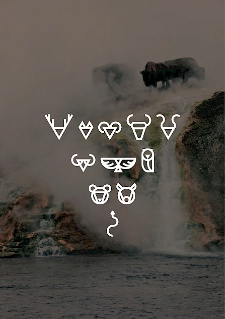
When the complete alphabet was designed, I quickly add a set of symbols. First I’ve found some interesting signs attributed to shamanism. As I know a little bit on the topic, it seems to be only some folkloric signs but it could also produce some decorative effects. Then I added few animals symbols and a wide set of pattern based on the complete alphabet.
After exchanging some very basic type specimen with the stylist, I quickly set some double spread pages for the catalogue. That was the very first use of the font named Shaman-project at this time. We had done some back and forth discussions about the covers, some spreads and opening pages for the chapters.
At this time I became a freelance graphic designer because of losing another time my job in a communication agency. That was not a choice, that was the easy way for spending my time working on few commissioned works while looking for a “real” job. So Shaman project remains an opportunity to design another book, what I really love to do, exchanging with a creator and telling me it was a good opportunity. Saying that is just the positive aspect: the creator was a mythomaniac (he was not a stylist), the book was a real project only on my hard disk, I was really bad as a jobless designer and my couple was in a bad mood.
Typedesign was a side practice, when my personal commissions gave me the freedom to design my own tool for the best project. But regarding Shaman Project, I never really lost my time.
Shaman serif
In April 2016, I was no longer a graphic designer and turned for becoming an Art teacher in middle school. In April I remembered being aware that I was the only guy over 700 peoples winning the competition to become a teacher. Well, lucky me… My couple was still in a difficult state but a new balance was surely arriving. I should keep proceeding.
So, April 2016, I was officially an art teacher, working for french ministry of education. Since july, I just had to teach, evaluate and finish my master thesis. I was more comfortable, finding time to draw some new type design. What I would do wasn’t totally clear in my mind but I started experimenting with serif type design and thought it would be fun to see what this geometric sans, Shaman Project, would look like with serifs, bringing something warm and human on a quite rigid skeleton. First I set the A, L and O letters and declined all the uppercases in few days. Some minors adjustments were done regarding the letter S & J.

A quick comparison between Shaman Project & Cantique.

First test with the capitals only. S was still messy but the whole spirit was here.
After some weeks without any corrections, I’ve started to design the lowercase in a more typographical way. I use to prefer uppercases than lowercase, so this job was not my favorite. The first letters to be drawn were still o, i and n. The modular basis was still really important and I had done very few optical correction on it. I remember having designed some old style figures like the simple a, the long s, but it was for pure economy. I was not in the mood to set the lowcase in a too old-style vibe. The ampersand was added during the VTF Saint Jean Porte La Tine workshop.
First lowercase: long s with a rounded a, still available but as old style alternate. The general mood was too old-style for me.


Cantique
I also decided to rename the font. Shaman was a starting point but it was no longer an aspiration. Instead, I was seeking for a dynamic balance between Love and Spirit. So Cantique, as a reference to the Cantique des Cantiques (Song of the Songs) was a perfect balance: French elegance of old bookplate, spiritual and sensual love with a nice spelling.
The months of May & June of 2017 were resting time for Cantique. I passed my Master thesis and was invited to continue with a PhD, a dream since few years. This moment was a revelation: I was lying to myself for years and I felt my brain was now working by his own. I was free because I was no longer able to lie to myself. Teaching was a great opportunity to spend time with my sons, to work on personal project and to learn from pupils (it’s never the opposite). So? What about type design? Where was Cantique? It was ok, on my computer, a quick job done. I decided that there was no need to polish the shapes and curves. I was experiencing a kind of freedom, sure, my ex-wife and I were living under the same roof but we were again friends.
If I wasn’t spending more time designing Cantique at this time was for another reason. I had met someone.
But July was a very deep and sad moment. I spent many afternoons alone in front of my computer, trying to avoid sad moments, designing some alternates glyphs, implementing some ligatures for the uppercase and lowercase. I’ve developed also a set of decorative patterns by then. Each pattern was a repetition of a glyph in a ornemental way.
At the end of the summer of 2017, the font was quite functional and tests were done with a layout of the Cantique des Cantiques text. It soon became a real editorial project for me with the will of having the book printed as a gift to someone.


A spread of the type specimen as a table of content.
Cantique in the end
Perhaps I was not ready yet for letting the type start its life by its own. The kerning was still uncompleted and I felt the font was no longer a necessity, even if I’ve used it for some personal projects. I was happy with Cantique but didn’t really have the stamina or the will to add the extra life that was not mine to be able to give it to others.
I moved to my own apartment in january, telling the children we were no longer in couple, trying to teach in a very hard place, with pupils unable to stay calm or even respectful for any adult. I was in pieces, personally, emotionally, professionally.


Early use of Cantique for a personnal project, illustrations for a small Metaphysical dictionnary. Illustration by myself.
I was approached in spring of 2018 by the spanish magazine Neo2 to share one of my fonts with the suscribers. I offered Cantique instead of an old font (no longuer on the VTF site), the editor enjoyed the idea. Minor changes were done and I’ve designed the dedicated page wich appeared in issue 159 of July 2018.

Cantique is sharing
I should add a special thanks to Ariel, who I introduced into the Velvetyne team in october 2018. He has been a generous person who shares a deep interest in my modest work. I asked him if he would agree to help me in the kerning task. He soon accepted and worked in a very methodic & professional way, keeping what was correct from my file and slightly polishing everything. He was also able to create some new ligatures for the capital and also to extend the glyph set for latin, adding some broader language support.
His help was like finding someone able to take care of your personal belongings while being at hospital: while you are no longer able of taking care of yourself, someone is doing what still remains necessary.

Some ligatures, alternate glyphs, numerals and so on.
His help was a motivation for starting an italic that never really took form. During one year or so, the files stayed in a github repository, waiting for the right moment to be released. During this time, my personal situation went very bad and type design was no longer my interest. Correcting the font or releasing it was something too early, like ending a sentimental relationship… The divorce step was on its way, I had lost some friends, my ex-wife was no longer a friend but an enemy and I was also her enemy. But most of that, I’ve hurted someone I deeply love, losing her contact was the hardest step.
But what’s going on? Next step is coming soon. After some publication of a quick video displaying the type specimen, I received a like mention from a greek type designer. I’ve get in touch with Tasos Varipatis who was interested in developing the greek version and quickly proposed to add the cyrillic version on his list too.

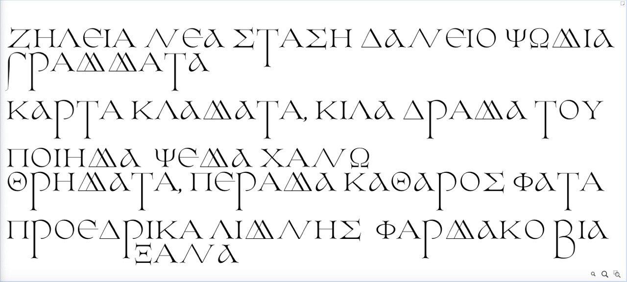
Beta version of Cantique greek by Tasos Varipatis, still in progress.
I’m glad to see the font is living its own life. I can’t also imagine what people will do with it. I don’t pretend to have put more that a tiny part of me. But it’s sure Cantique represents an important, quite special, moment of my life, something that no longer exists but in my memory. Deep and personal thoughts have been injected in this design.


Designing Cantique was a big lesson for me.
Its helped me learning design is not just finding an idea, neither having the technical skills to accomplish it.
As everything dealing with creation, it’s the ability to do something because you are the main tool and content, able to put a tiny bit of yourself inside shapes & curves. Being in a good or bad mood is a necessity: some needs to be strong, some to be weak. Weakness is a power if you understand it’s also you in a different state. Designign is not doing stuff, it’s creating new balances between feelings, thoughts & sentiments, only with shapes & colors. Creating is magic that could be explained. Design is also share: sharing the final design, sharing ideas and abilities. But Cantique was possible because I am happy of someone’s existence. Happy to have been able to cross the different steps on my life, from creating, teaching, designing, looking for the balance between spirituality and sensuality, losing someone, being away from my sons. Its forged a whole philosophy: stability is an illusion, like absolute concepts. I’m not a teacher, neither a type designer. I’m just trying to be a man and life is helping me.